
I
find the original illustrations for Dragon Cards from a number of
sources, but few of them are exclusive. It's possible other
cachetmakers will use the same art. However, I try to modify the art
before using it, both to make it more unique, but also because it
doesn't quite meet my needs. Here are some examples.
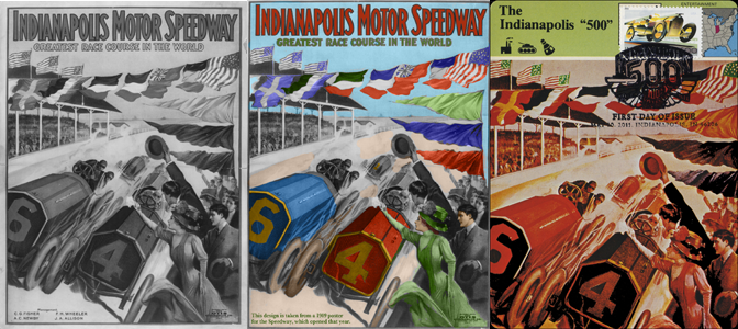
For the Indianapolis 500 Dragon Card, I found a
black-and-white high-quality digital illustration of a poster from the
Indianapolis Motor Speedway on the Library of Congress online site.
It's shown on the left:
 Both Jazz designs are from clipart. One was used pretty
much
as supplied, but I made some changes to the other.
Both Jazz designs are from clipart. One was used pretty
much
as supplied, but I made some changes to the other.
The original clipart is in the top picture.
The second shows the art "sized" to leave enough room for
the stamp and postmark, and the blocks of color extended into the
stamp/cancellation area.
But I decided the orange was too dark to show the Digital
Color Postmark to best advantage, so I changed it to a a lighter color.
At this stage, I also added the Dragon Cards logo.
However, something was still missing. The other Jazz clipart
illustration included a trombone; this one didn't. I play trombone, a
noble instrument that is too often overlooked.
When we were booking a band for my son's bar mitzvah (1998),
I mentioned to the contractor (a trumpeter) that I played trombone,
although I wasn't interested in playing wakes, weddings and bar
mitzvahs. He replied, Mr. de Vries, if it's a three-piece band, it's
piano, drums and bass. If it's four-piece, we add saxophone. Five, a
singer. Six a trumpet. I'm sorry, but we don't get to a trombone until
seven or eight pieces."
Or the old joke, "What are the lyrics for a trombonist on
his regular gig? 'Would you like fries with that?'"
So my Jazz Dragon Cards had to have trombones in their
designs. Iin picture #4, the final design, I added a "sackbut" that
I think matched the modern-art feel of the original illustration.
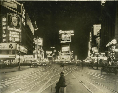
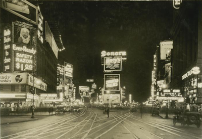
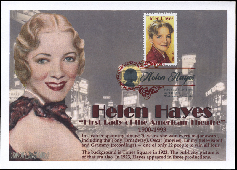
For the Helen Hayes Dragon Card, I found a publicity picture
(not quite a photo) of her about 1923, but no theater marquees showing
her name, from that or any other period. Although Hayes won awards in
television, movies and recordings, she was primarily a stage actress. I
did find a picture of Times Square from about 1923, and that's the
background of the card:
Inside Stories I • Inside Stories II • Inside Stories III • Inside Stories IV • Inside Stories V